Assorted data graphics
A collection of misc. data visualization work and interactive graphics.
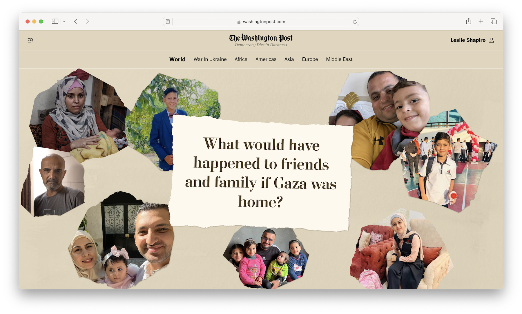
Design and development of a story about the personal toll of war in Gaza.
🏆: Award of Excellence, Infographics: International, Society for News Design (2024)
Tech used: React, animated data viz built with the Canvas API and custom Javascript animations
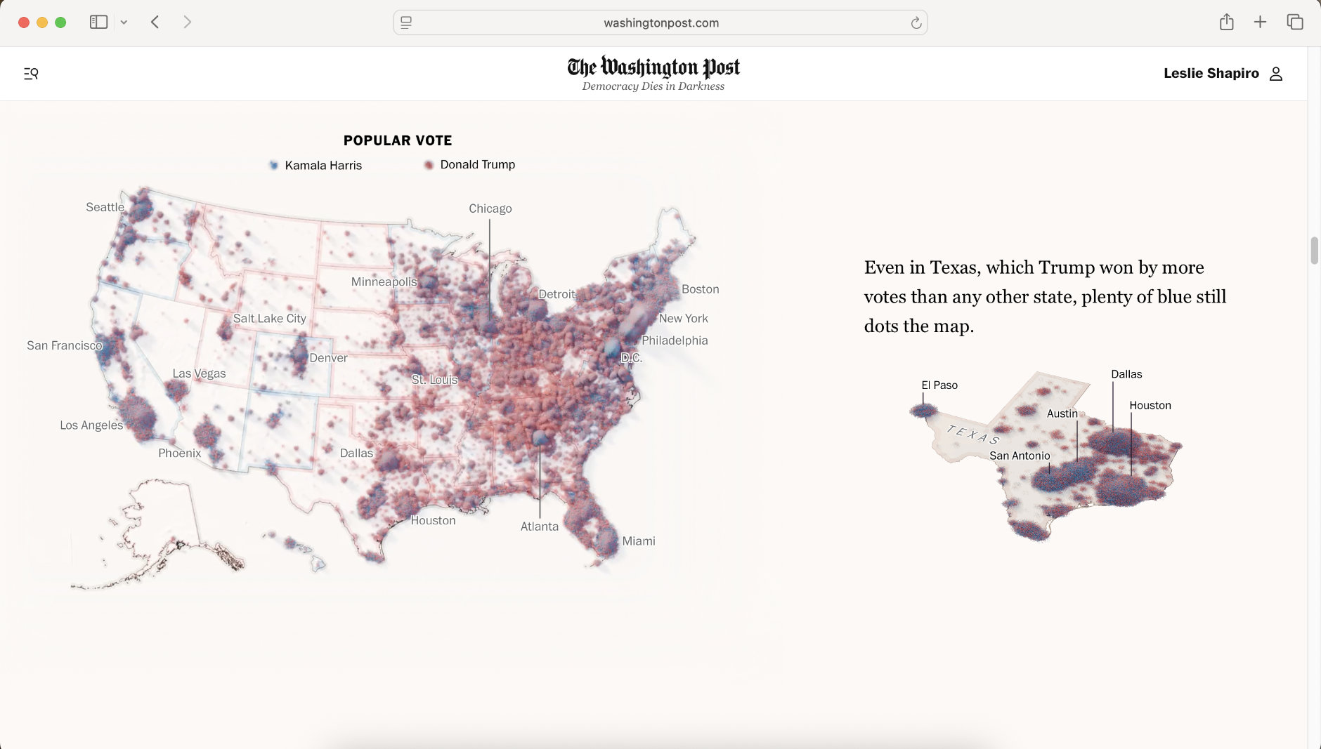
Design and development of a story showcasing each vote in the 2024 presidential election.
🏆: Silver, Current Affairs and Politics, Information is Beautiful Awards 2024; Bronze medal, Infographics: Politics & Elections and Award of Excellence, Page Design: Politics & Election, Society for News Design (2024)
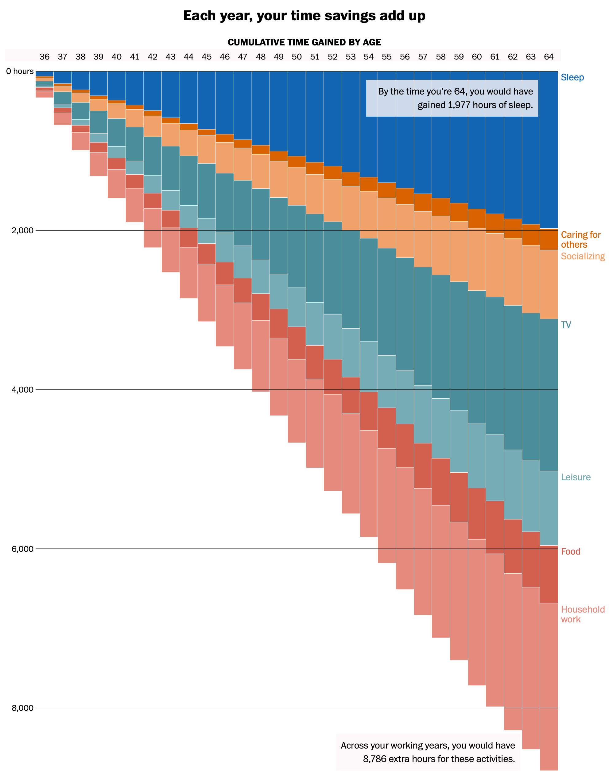
Design and development of a personalized interactive story about how a 4-day work-week would change your use of time.
🏆: Award of Excellence, Infographics: Business, Society for News Design (2023)
Tech used: D3.js animated charts, synced with user input states in React
Design and development of an animated scrolly chart for a story about how the 2020 pandemic recession was the most unequal in history.
🏆: Honorable mention, data journalism category, Society for Advancing Business Editing and Writing (2020)
Tech used: D3.js animated charts, synced to Intersection Observer scroll events in React
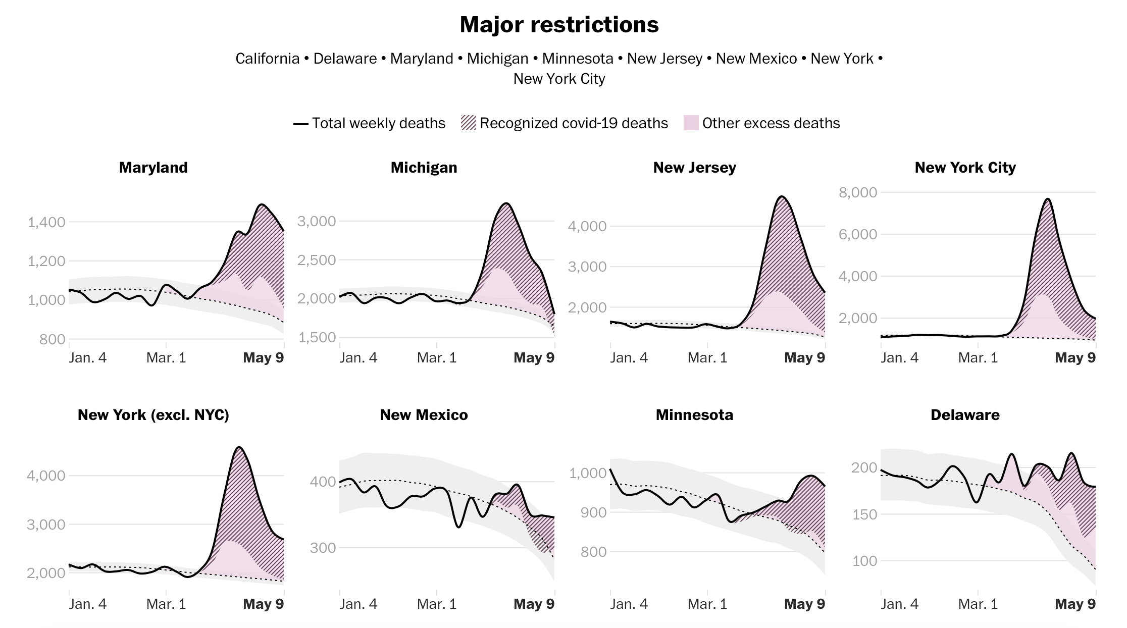
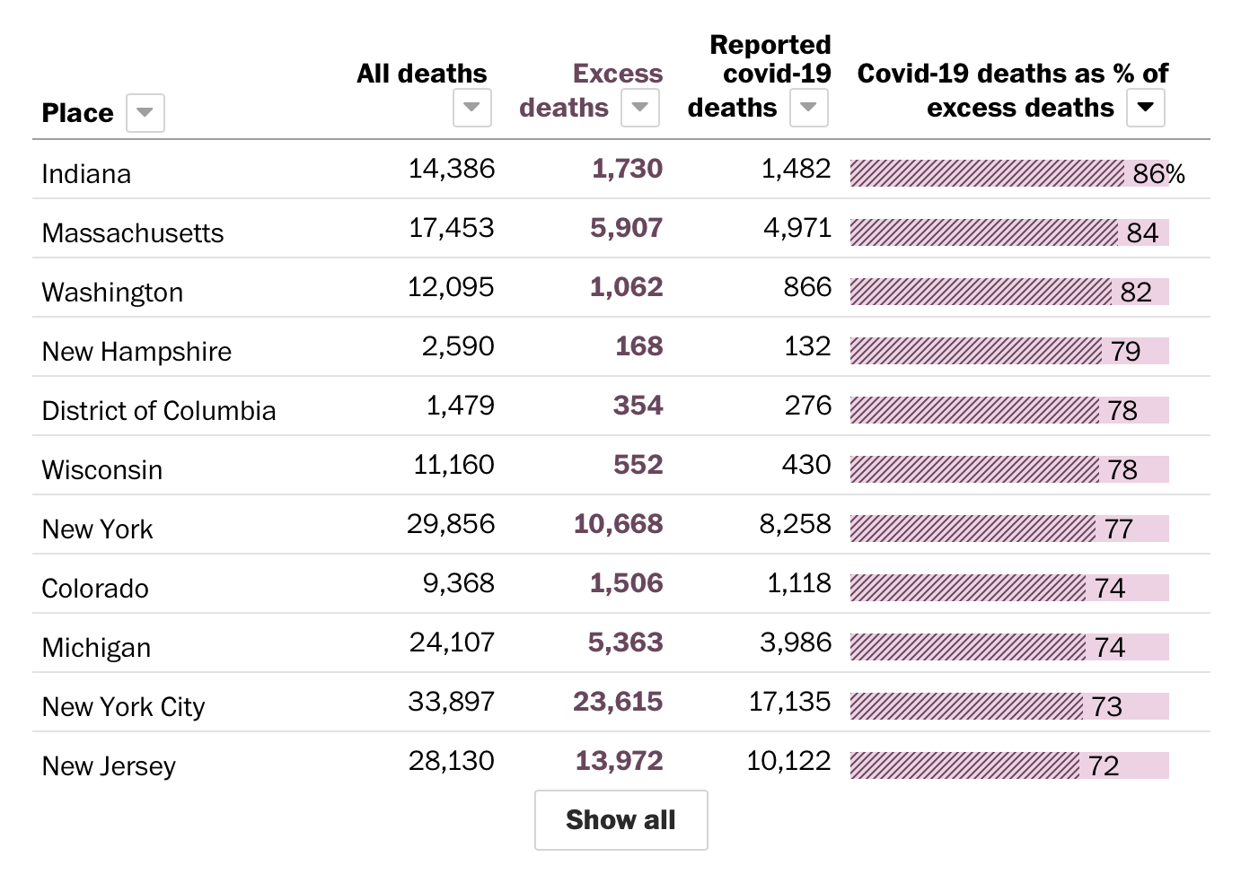
Design and development of interactive/generative charts for a story on excess deaths by state during the covid-19 pandemic.
A story capturing the sights and sounds of the Black Lives Matter protests in downtown Washington, D.C., using 360 degree video and audio
🏆: Award of Excellence, Infographics: Protests category (Society for News Design)
I designed the UI as well as developed custom 360 degree video players in React on a tight, week-long deadline.
Tech used: React, HTML video and audio APIs
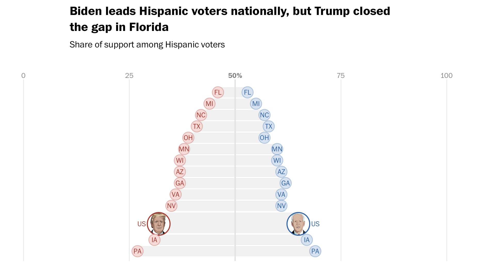
Design and dev for a live updating exit polls page that ran on Election Night 2020
🏆: Award of Excellence, Infographics: Politics category (Society for News Design)
